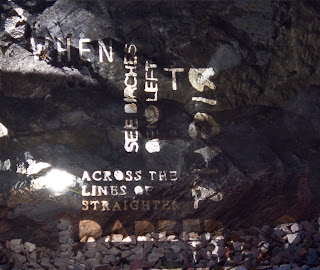
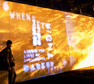
Overall this project has been a stream of experimentation, at the start of this process outcome was not a factor. After starting my first ideas I was restricted by facilities this left me forced to use one laser cut process although at first this was a hindrance as I began to experiment with shape, light, texture and form I saw a simple process could become more complex.
Auto graphic typography is something I really relate to I wanted to take experimental calligraphy from section one of the brief further using experimental method to develop my letter forms, using a structured guide to work from. The expressive nature of low-fi letter forms opposed to their Hi- fi counterpart parts really inspired me in this project the text itself I felt deserved an organic feel due to its context, which would then relate to the countryside, but then take the form of the urban environment in which it was placed.
If I had time to do this project again I would discuss time management as I feel although my body of work is substantial development in this area could always be improved, moreover I would have liked to spend more time in the photography phase of the project, and to develop the media of projection. My final outcomes achieved what I had set out to do (Taking a countryside poem into an urban environment) I felt I had learnt new aspects of typographic elements, Kerning, grid layout, leading and weight and applied these successfully to my project.
Urban poetry
Friday, 27 May 2011
Thursday, 26 May 2011
final outcomes
 Taking the images further into a Print developed the images from a simple photograph into a contemporary typographic piece. Using photo shop to manipulate the letter forms straight also removing the light source created an illusion of the burst of light.
Taking away the noise of the background environment means the viewer concentrates on the texture of the letter forms. The exposure time creates the idea of a ghost but still leaves an idea of the canvas the letter forms have been laser cut from. The piece uses two dimensions of perspective again adding to the effect of of urban environment.
My second piece uses a model to discuss size using the 'Civic centre, as a canvas to display the poem. It is a successful use of the urban environment as the area the project is place is the most urbanised area of Plymouth.
Using simple photoshop techniques I developed the image further by emphasising the texture adding some extra detail to disrupt the image to make sure the model was not the focal point the text is not as legible as I would have hoped so if I did this process again I would have used high intensity bulbs. Using contrast and curves I gained extra light to drive the viewers eye through the image. The tree the image has been taken by has created the light texture that I have further developed.
Light (Experimental) typography
Using light created my best results and I will probably take these images further into a final piece. Here I gained shape texture and was able to gain legible letter forms for the whole passage.
Manipulating the light an playing with exposure times created interesting results. The fact that the type took the form of the object it was projected on created interesting shapes and textures.
Taken straight photos with the light behind the stencil gave interesting shadows and forms.
Using different exposure times gave a ghost effect allowing the stencil to play with its environment and take the form of the rock and integratingwith the type.
The idea here was to play with size and legibility the clarity of the letters changed as we began to increase the size. Although using a model I was able to Justify size. This photo was taken on the Civic centre the most urbanised area of Plymouth.
Grass Outcomes
Taking photographs of certain areas of the piece created great and interesting results however the whole of the passage is what is needed to tie in with the brief properly. Manipulation of light worked well so I will take that further in my next experiments.
Grass and Light Manipulation (Experiment)
The idea behind this experiment was to discuss the idea of organic letter forms although the I think leaving the stencil over the grass for a couple of days would have gained better results.
My ideas of introducing textures work well here I think the letter forms are more interesting if the photographs are taken on an angle.
Manipulating light gains interesting effects during this process.
The best results for this idea where gained by taking photos of certain areas of type rather than pictures of the whole passage.
Flour Outcome
Taking the image into a grey scaled format adds more texture moreover the viewer takes time to discuss the forms due to the fact there is no colour relation to grass.
taking type to nature (experimentation)
To tie in with the brief and experiment with type I needed to find an effective way to take my countryside poetry and put it in an urban environment. I started by experimenting with flour this was an easy material to manipulate and when grey scaled would look like gravel.
Although some of the words where legible the smaller elements of type where illegible this could be due to the nature of the grass canvas.
The texture of this idea was quite interesting the shapes and form the type had taken in its environment and although this was not the result I was hoping for the process was invaluable. The legible type singled out had deconstructed elements.
Subscribe to:
Comments (Atom)


