Overall this project has been a stream of experimentation, at the start of this process outcome was not a factor. After starting my first ideas I was restricted by facilities this left me forced to use one laser cut process although at first this was a hindrance as I began to experiment with shape, light, texture and form I saw a simple process could become more complex.
Auto graphic typography is something I really relate to I wanted to take experimental calligraphy from section one of the brief further using experimental method to develop my letter forms, using a structured guide to work from. The expressive nature of low-fi letter forms opposed to their Hi- fi counterpart parts really inspired me in this project the text itself I felt deserved an organic feel due to its context, which would then relate to the countryside, but then take the form of the urban environment in which it was placed.
If I had time to do this project again I would discuss time management as I feel although my body of work is substantial development in this area could always be improved, moreover I would have liked to spend more time in the photography phase of the project, and to develop the media of projection. My final outcomes achieved what I had set out to do (Taking a countryside poem into an urban environment) I felt I had learnt new aspects of typographic elements, Kerning, grid layout, leading and weight and applied these successfully to my project.
Friday, 27 May 2011
Thursday, 26 May 2011
final outcomes
 Taking the images further into a Print developed the images from a simple photograph into a contemporary typographic piece. Using photo shop to manipulate the letter forms straight also removing the light source created an illusion of the burst of light.
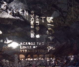
Taking away the noise of the background environment means the viewer concentrates on the texture of the letter forms. The exposure time creates the idea of a ghost but still leaves an idea of the canvas the letter forms have been laser cut from. The piece uses two dimensions of perspective again adding to the effect of of urban environment.
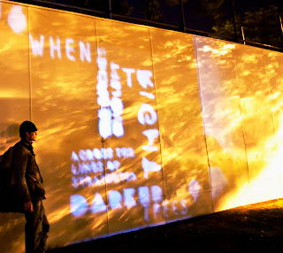
My second piece uses a model to discuss size using the 'Civic centre, as a canvas to display the poem. It is a successful use of the urban environment as the area the project is place is the most urbanised area of Plymouth.
Using simple photoshop techniques I developed the image further by emphasising the texture adding some extra detail to disrupt the image to make sure the model was not the focal point the text is not as legible as I would have hoped so if I did this process again I would have used high intensity bulbs. Using contrast and curves I gained extra light to drive the viewers eye through the image. The tree the image has been taken by has created the light texture that I have further developed.
Light (Experimental) typography
Using light created my best results and I will probably take these images further into a final piece. Here I gained shape texture and was able to gain legible letter forms for the whole passage.
Manipulating the light an playing with exposure times created interesting results. The fact that the type took the form of the object it was projected on created interesting shapes and textures.
Taken straight photos with the light behind the stencil gave interesting shadows and forms.
Using different exposure times gave a ghost effect allowing the stencil to play with its environment and take the form of the rock and integratingwith the type.
The idea here was to play with size and legibility the clarity of the letters changed as we began to increase the size. Although using a model I was able to Justify size. This photo was taken on the Civic centre the most urbanised area of Plymouth.
Grass Outcomes
Taking photographs of certain areas of the piece created great and interesting results however the whole of the passage is what is needed to tie in with the brief properly. Manipulation of light worked well so I will take that further in my next experiments.
Grass and Light Manipulation (Experiment)
The idea behind this experiment was to discuss the idea of organic letter forms although the I think leaving the stencil over the grass for a couple of days would have gained better results.
My ideas of introducing textures work well here I think the letter forms are more interesting if the photographs are taken on an angle.
Manipulating light gains interesting effects during this process.
The best results for this idea where gained by taking photos of certain areas of type rather than pictures of the whole passage.
Flour Outcome
Taking the image into a grey scaled format adds more texture moreover the viewer takes time to discuss the forms due to the fact there is no colour relation to grass.
taking type to nature (experimentation)
To tie in with the brief and experiment with type I needed to find an effective way to take my countryside poetry and put it in an urban environment. I started by experimenting with flour this was an easy material to manipulate and when grey scaled would look like gravel.
Although some of the words where legible the smaller elements of type where illegible this could be due to the nature of the grass canvas.
The texture of this idea was quite interesting the shapes and form the type had taken in its environment and although this was not the result I was hoping for the process was invaluable. The legible type singled out had deconstructed elements.
Friday, 20 May 2011
applying art to the environment
Looking into different ways to discuss stenciling rather than the cliche spay paint will enable me to create an effective and new outlook. Light although hard to manipulate will create interesting forms My A1 laser cut stencil and expense may limit the structure of this idea.
Using the letters form laser cutting could create an interesting form of type. Using materials relating to the countryside. However what draws me to this piece is the colour contrast so maybe using cat litter or fish gravel.
Glue on perspects cost is an implication here maybe play dough on glass could be used or etch frosting chemicals although the chemical would be permanent.
getting an idea for application (shape and size)
This poster was to give an idea of how the type would look projected I have used photoshop to manipulate the building I find mulilayering adds interesting textures and would re enforce the type when I come to photograph my type in the environment.
applying type and image
Adding texture to the type and trying out how to boarder the type with the environment my first ideas where to print and laser cut this piece however due to resource restrictions I will have to look for new ways to express my type in the environment.
Hand drawn type experimentation
After building a type structure it was important to take the type element through an experimental process this allowed me to interesting shape rather than thinking about how the letter should look. To achieve this I turned the type structure upside down to help me separate my self from the letter forms
-Using pen to create defined lines
For this experiment I used a rubber point and ink to create a difference in the weight of the type that I could not easily control collected ink would create bleeds and also lighter lines all the forms where created using single strokes.
- Rubber point, Ink and long single strokes.
Using a hard brush resulted in a nice bleed I tried to use different pressure and sides of the brush.
- Using a hard brush..
Taking the type to boundary helped me to relate to shape using a
pipet I used dripping ink to bleed the form to there extremity.
Monday, 9 May 2011
Building a type structure
To Keep alignment and structure I have written my type in a format to encapsulate the viewer making it interesting to read and develop the type from a simple passage into something aesthetically pleasing. Changing the weight, kerning and leading has enabled this. Moreover I wanted to develop a building type structure to help the type fit the textured image at a later stage.
This now allows me to develop the type auto graphically using low fi techniques before bringing it back into a digital format.
specific research
Ed fella uses different type techniques to create interesting calligraphy as my ideas are based around the countryside I would like to employ organic type techniques to my work.
Auto graphic techniques are a strong factor within this work with a clever use of structure.
Carson also employ auto graphic techniques within his work cutting and shaping letters to distress the nature of his type.
Auto graphic techniques are a strong factor within this work with a clever use of structure.
Carson also employ auto graphic techniques within his work cutting and shaping letters to distress the nature of his type.
Creating texture
To add an urban theme I intend to use urban architecture to add rhythm to the context using photoshop techniques to design a complex texture to hold type for printing purposes. Using a birds eye picture of Plymouth.
De saturating the image I intend to make a stencil effect to pick out the key elements of this image although I am looking at shape rather than detail.
posterising the image gives a two tone effect to the image allowing shape to be the prominent feature.
By using a cut out filter and invert gives a bold texture by inverting and removing some the areas of the picture I am able to distinguish areas I would like to highlight.
Typographic Experiments
My first process was to experiment with type and try out some new ideas for creating interesting type faces by adding pins to type then wrapping them in cotton creates an interesting delicate typeface that has an unstructured movement. The piece would become more interesting with light and shadow photography
This is a photo of a couple around union street in 1902, using a compass I have added scratched type to see the effect of this to image although the placement of the type is important the effect is effective.
Using techniques I used on the photo above I though about using the passage on something simple like a fruit creating a interesting relief into the skin as the skin degrades the type becomes more interesting. Ideas for these shapes came from my mood board although maybe not built for purpose.
Poetry...
Using interesting lines form a countryside poem will be the basis for my typographic installation adding in imagery of urban scenery to co-inside with the environment that the piece will be placed to discuss the comparisons of the two.
Robert Frost 'Birches'
"When I see birches bend to left and right
Across the lines of straighter darker trees"
Simon Armitage 'Hard'
Robert Frost 'Birches'
"When I see birches bend to left and right
Across the lines of straighter darker trees"
Simon Armitage 'Hard'
'Here on the Hard, you're welcome to pull up and stay;
there's a flat fee of a quid for parking all day.'
Robert Burns `'Natures Law'
'Here, on this had, does Mankind stand,
And there is Beauty’s blossom.”
All are interesting passages from poetry that inspire me and I think the context will suit the brief.
there's a flat fee of a quid for parking all day.'
Robert Burns `'Natures Law'
'Here, on this had, does Mankind stand,
And there is Beauty’s blossom.”
All are interesting passages from poetry that inspire me and I think the context will suit the brief.
Friday, 6 May 2011
Urban Poetry
Choose a poem that evokes and celebrates the countryside or nature. Edit a few lines from the poem enlarge and manipulate the words letteforms that you feel are appropriate and place the words in a city street then record your installation with photographs or video
Subscribe to:
Comments (Atom)


